Marvel Heroes Art Direction
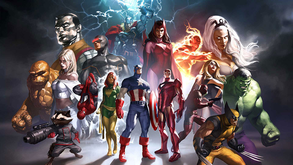
As Art Director for the “Marvel Heroes” MMORPG, I had a team of 30 artists in-house, and oversaw all aspects of the game graphics. From establishing the style of the game, to working with Marvel on the characters and brand compliance, to overseeing the environments, animation, VFX, UI, and marketing assets such as key art and trade show booth displays.
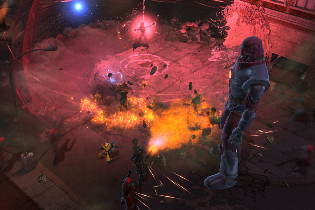
Character Visual Development

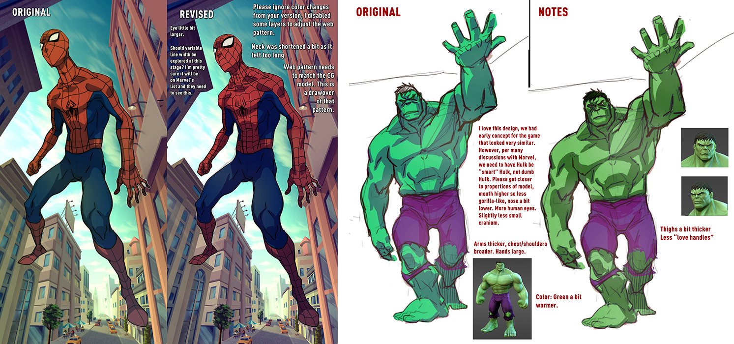
Based on my original pitch for the look of the game, and before I had built the art team, we started with the visual development of the characters. With the Marvel IP, we’d all seen these characters depicted hundreds of different ways, so it would be a challenge figuring out what OUR Spider-Man or Hulk would look like. I started out having several comic artists give us some character designs based on my pitch handout. Comic book artist and pal Sanford Greene did these amazing designs that really resonated with the development team:
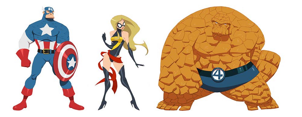
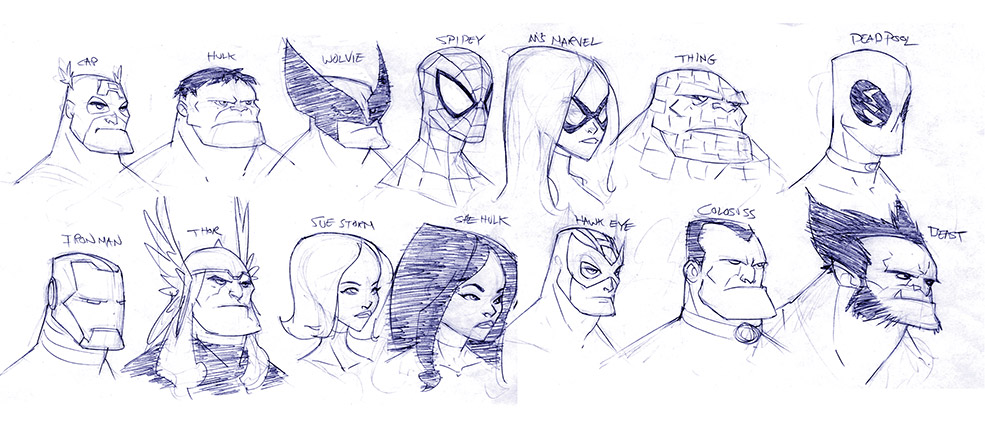
Captain America
We started doing some early exploratory character digital sculpting/modeling to see how the designs would translate into a CG model. I stared with Captain America as he’s a fairly straightforward superhero body type, and he’d be the average model, given the extremes such as Hulk (giant, bulky) and Spider-Man (shorter, wiry build). Here’s my handout for Captain America to start the modeling process:
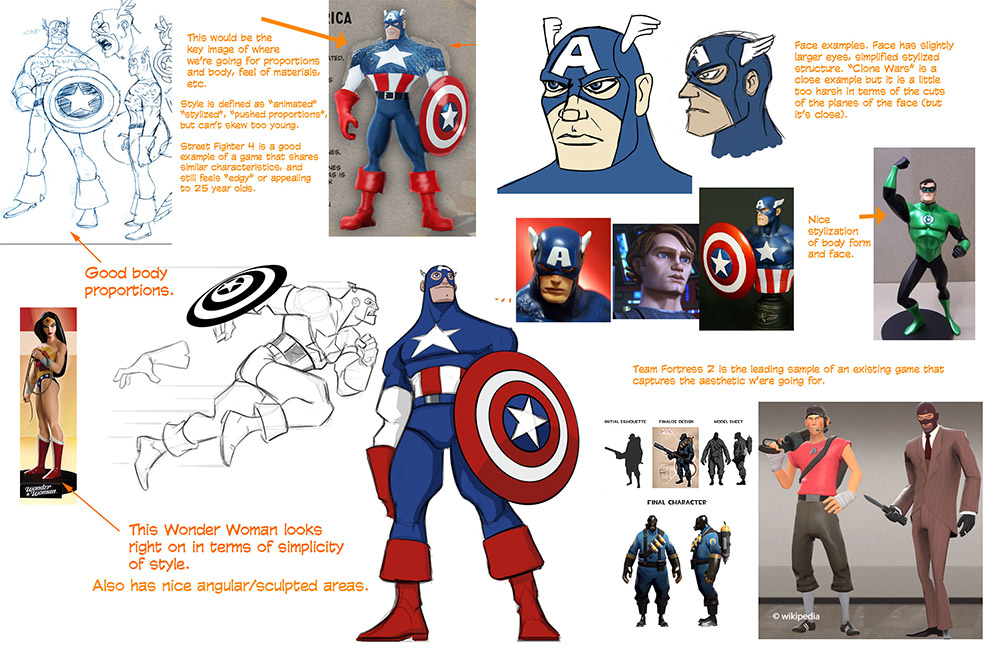
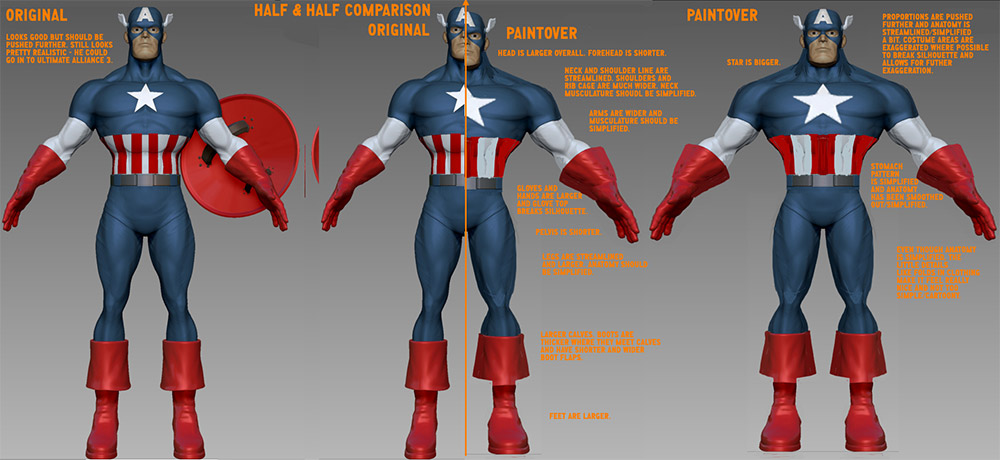
Model development by Daveed Kaplan with my notes
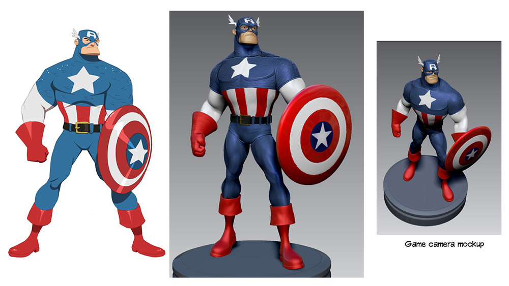
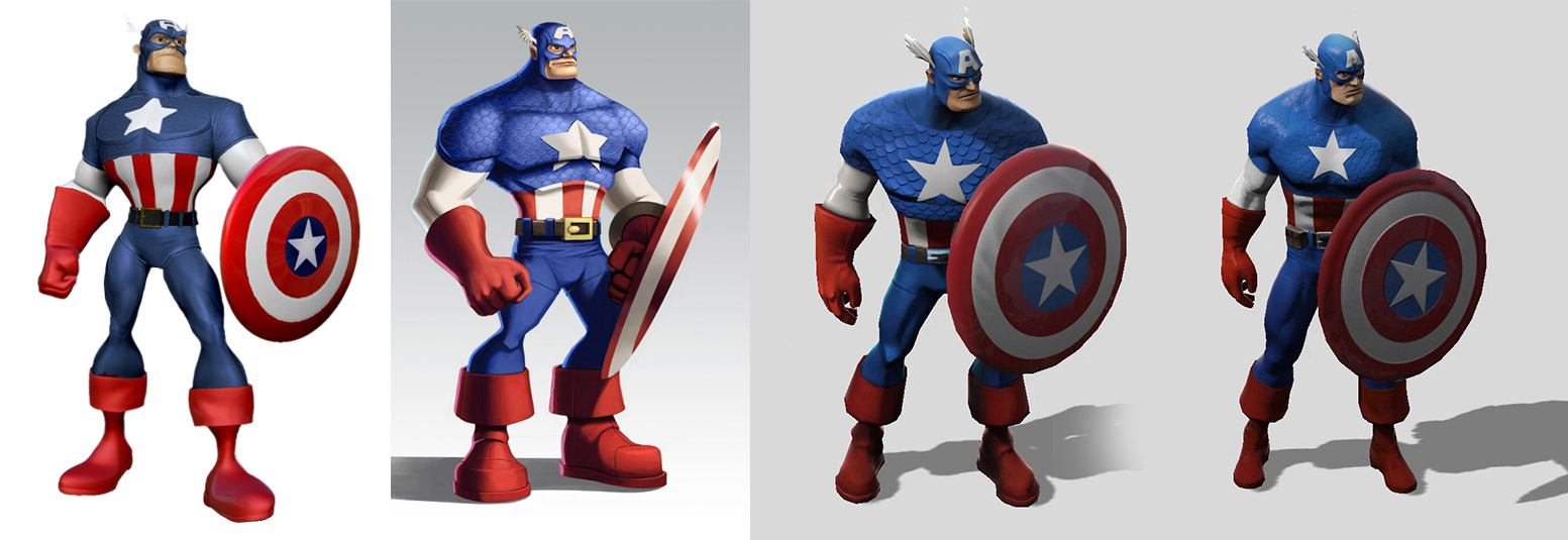
Through the visual development phase of the project we did a lot of iteration on the character designs. You can see in this progression of Captain America designs we moved to a more traditional comic book look, with more realistic proportions, anatomy, design, and stylization. Marvel was very supportive of me in the evolution of the designs, and eventually we arrived on this look we thought aligned with fans expectations for the project.
The Thing
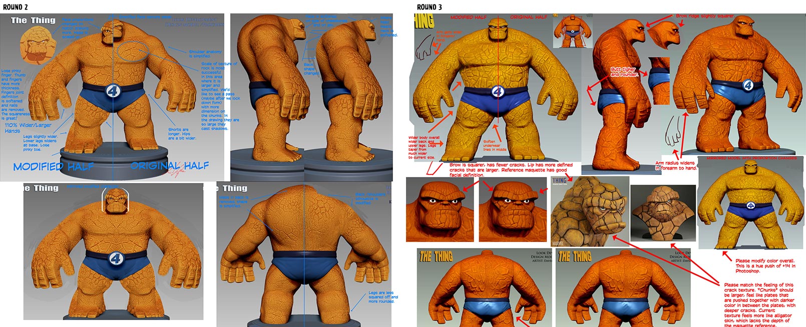
While still in the early character visual development, the Thing was another character we developed as a CG model. Sanford’s design was awesome, but how would we translate it in to 3D? Here are some of my notes on the process:
Ms. Marvel
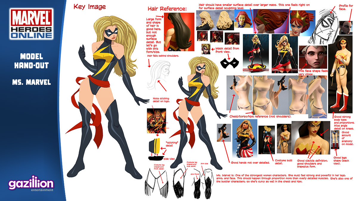
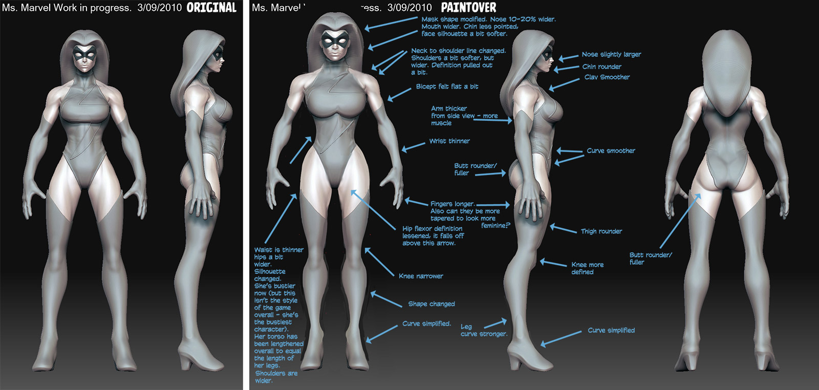
We then worked on Ms. Marvel with sculptor Josh Singh. Here’s my direction for her model, and below is her model progression and notes:
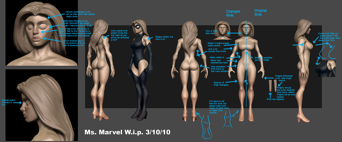
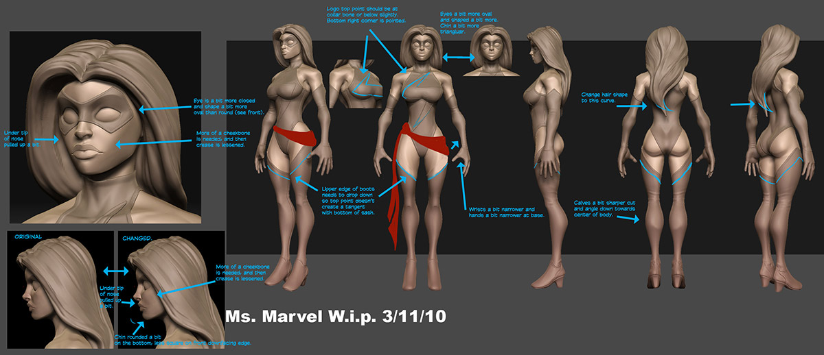
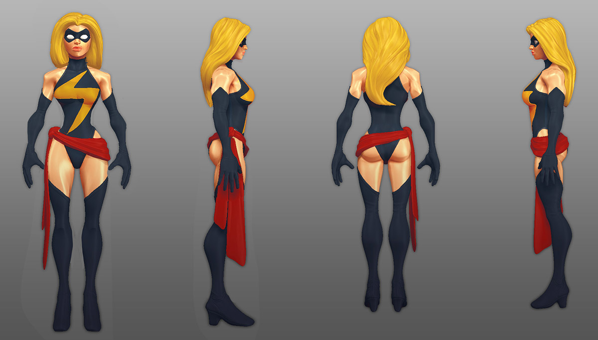
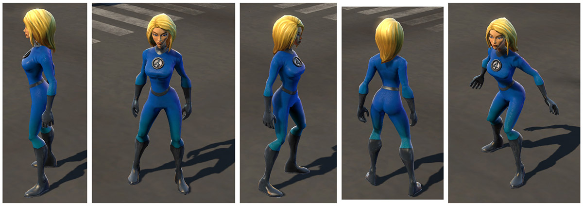
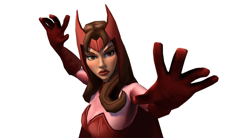
We did a lot of work with the more stylized/animation look for the characters. You can see this lineup that existed in game at one point.
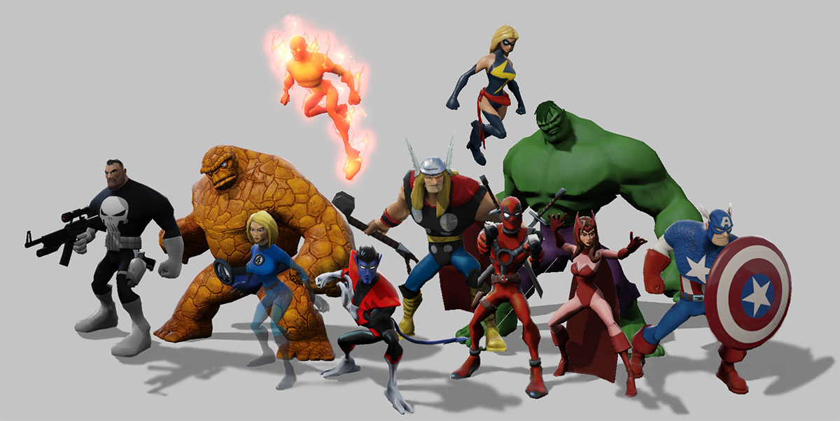
The silhouette variation was one of the stylistic pillars of the original pitch were definitely a big part of this design.

Pivoting to the Final Look
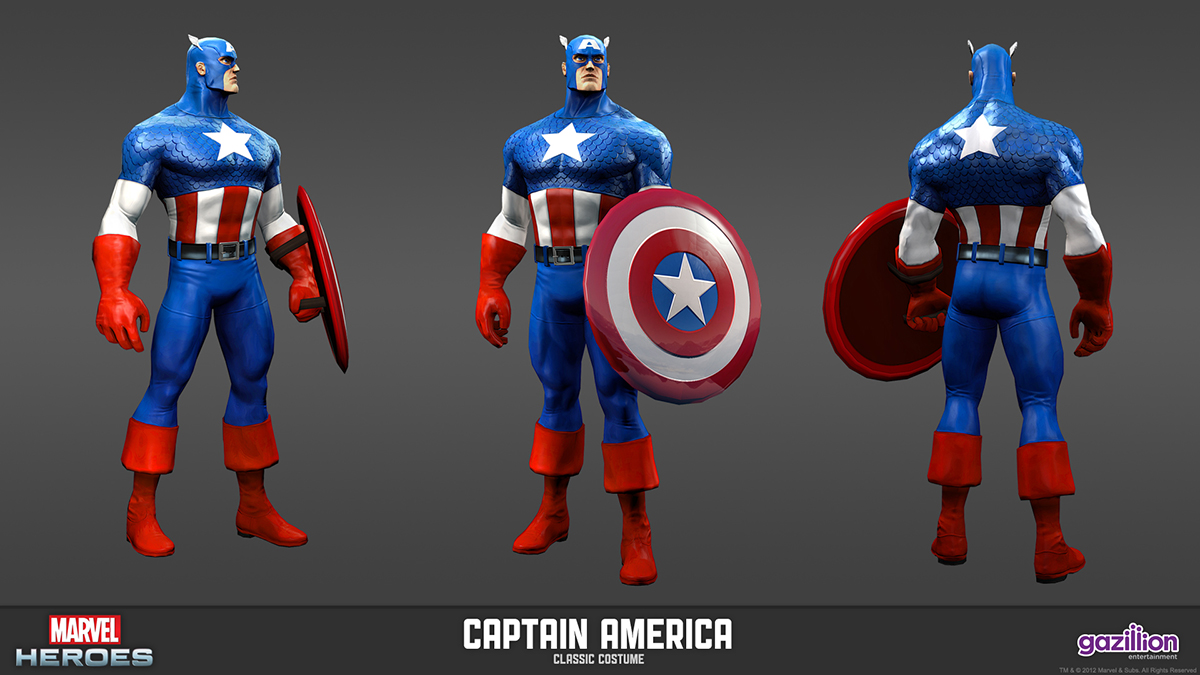
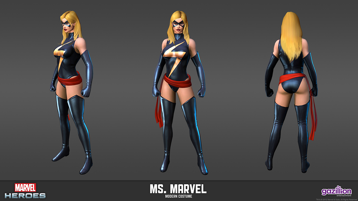
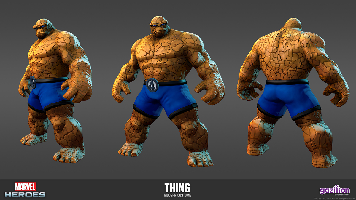
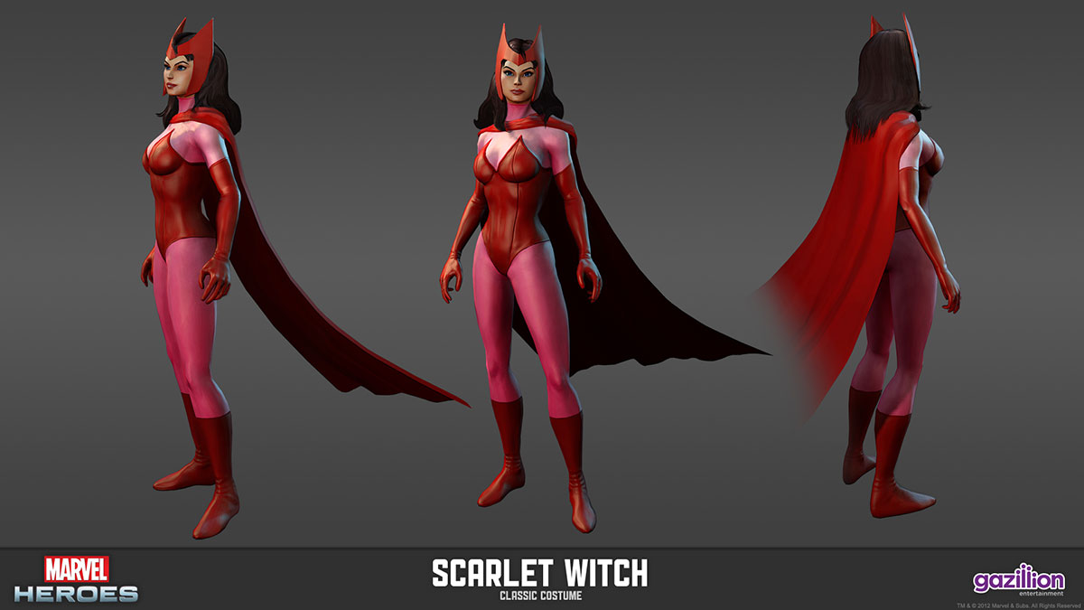
Ultimately the final look of the game went a different direction, as you see below. During about a year of visual development, Marvel decided they wanted a more comic book influenced representation of the characters. They were looking at their larger entertainment portfolio and how our game would fit into it. The decision by the development team in that same timeframe to use the Unreal engine gave us the ability to have characters that would look better in a realistic style with a larger tech budget and Unreal’s real-time rendering.
When developing the original style, a large part of the discussion that was affecting the aesthetics was the technical pipeline and the game engine. We weren’t sure we were going to be using the Unreal engine for a good part of the project, so we were projecting to have more strict tech budgets/limitations for the characters. The above more stylized characters were designed to look good with these limitations. The below character aesthetics definitely took into account that we could have at least twice the poly budget of the characters above, and though it’s a different style from what I originally envisioned, I’m happy with how they turned out. A lot of the underlying ideas from my original pitch like pushing silhouettes and shape variation between characters and a bright saturated color palette persisted through to the final look, but were dialed back to fit the style.
Models below by Chris Anderson and Tyler Fermelis.
Environments
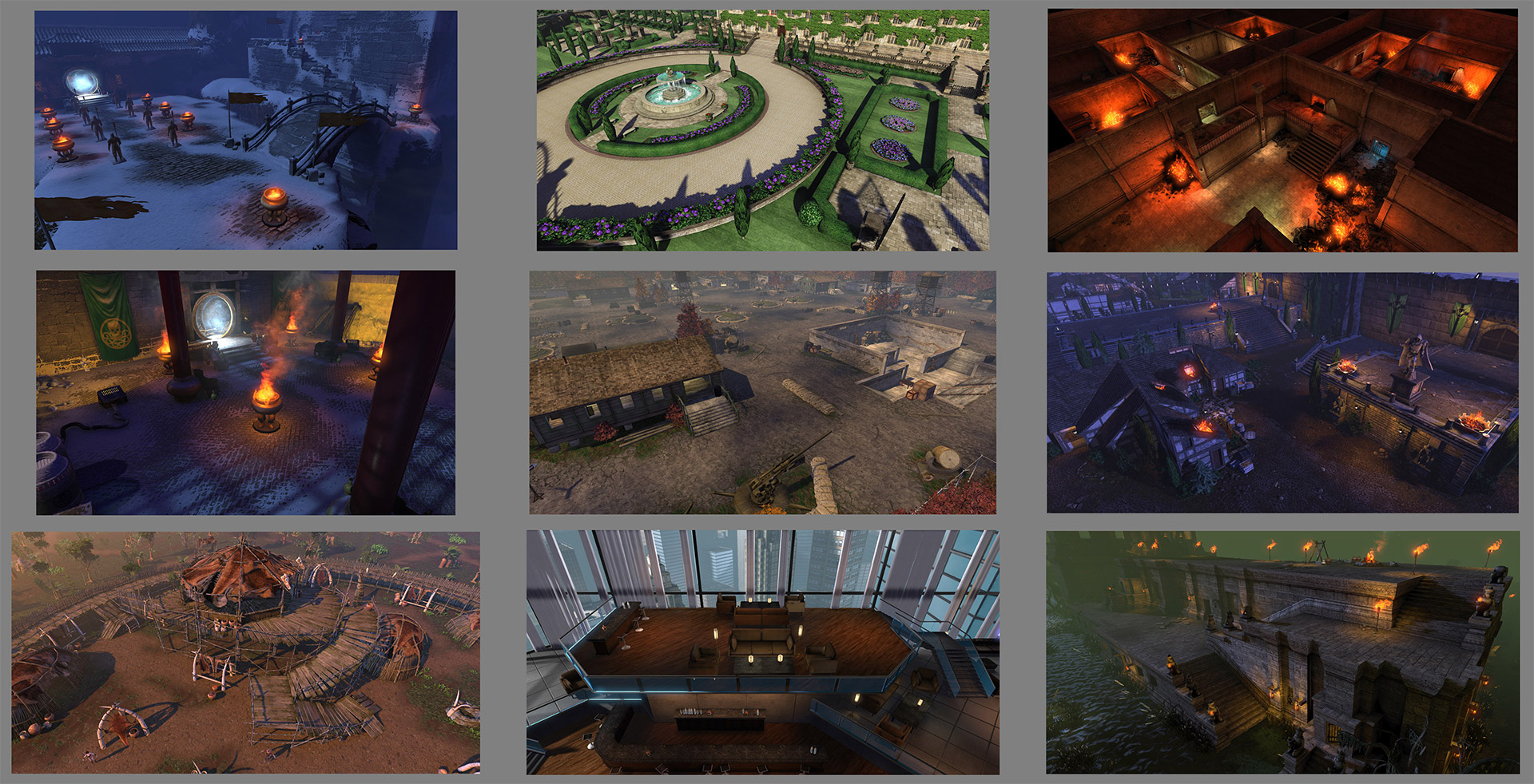
One of the aspects to the game that made the environment creation very tricky was the randomized levels. As a result, small to large set pieces were designed and created. We’d create images such as this one which we called “Disneyland maps” as a way to look at the features of a level and call out color progression through a level and the set pieces to be built. Art by Nino Navarra.
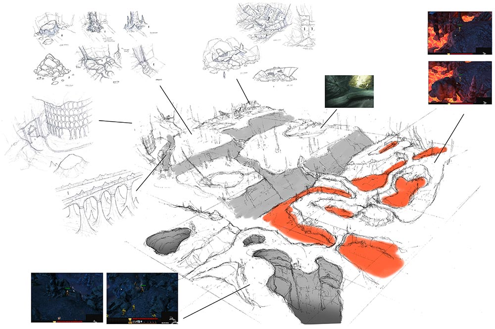
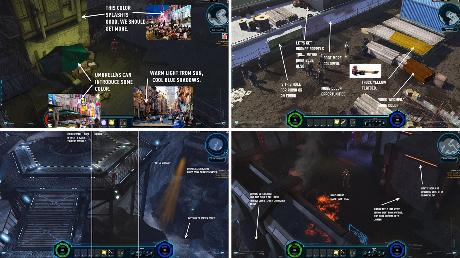
Some of my environment notes. Most of my notes were given in review sessions verbally (which is possible when you’re lucky enough to have the entire art team in-house on the project!)
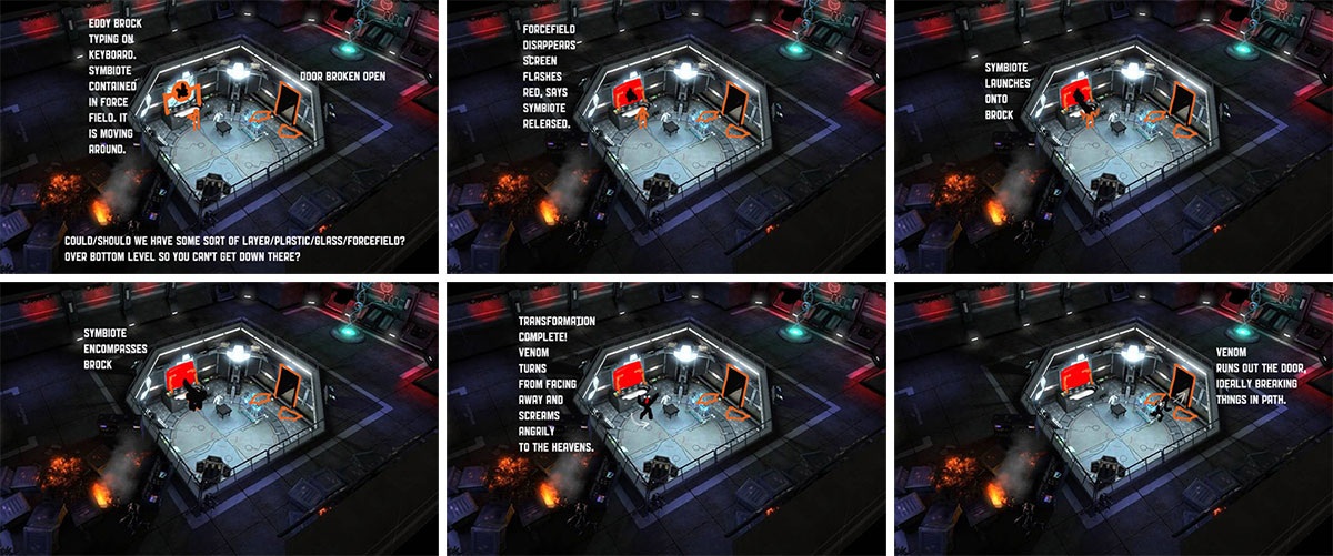
Though we had randomized environments, we had specific set pieces that set up storytelling “memorable moments” such as this, where Eddie Brock uses the distraction in the Raft to break into a lab, unleash the Venom symbiote, and escape. I storyboarded it out and it was turned into an in-game cinematic triggered when you entered the cell.
Animation, VFX, and Cinematics
With my background in animation, I was heavily involved in this part of the production. At the character planning meetings I’d help plan out moves and attacks, idles, fidgets, etc. In the daily animation reviews I’d give notes, trying not to injure myself while demonstrating superheroic moves.
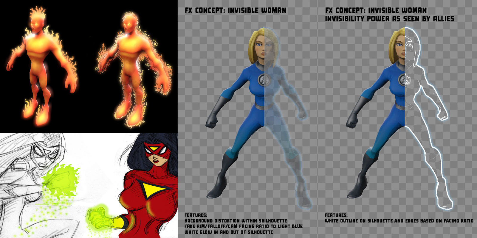
I did some VFX design in the early visual development stages of the game production, but once we really got moving my role was directing up front in character planning meetings, and then giving verbal notes at daily rounds. With an IP as loved as Marvel, we had to get the flavor or spirit of VFX we’d seen drawn in the comics (and film and animation) working in our game and really feeling like each set was unique to each character and true to the source material.
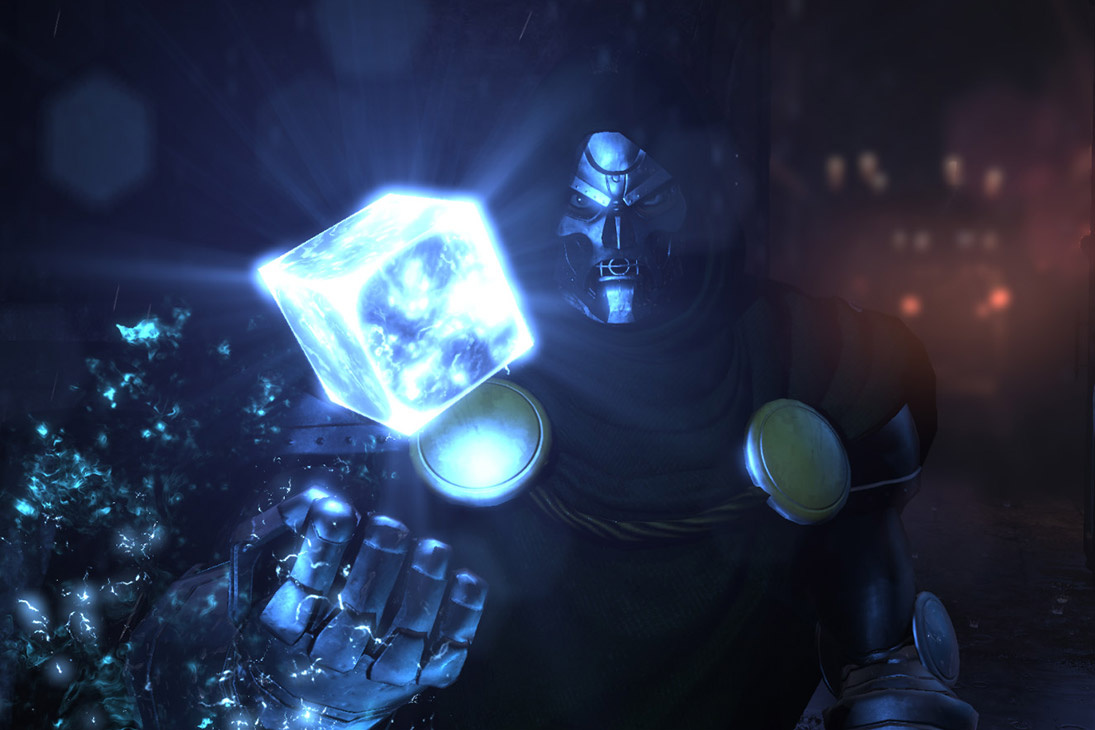
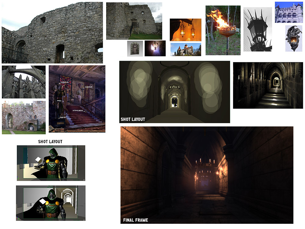
Our first teaser trailer for the game was an in-game rendered cinematic, featuring Dr. Doom standing at the end of his castle hallway holding the cosmic cube. Here’s a mood board I created for it, with a frame of it as well.
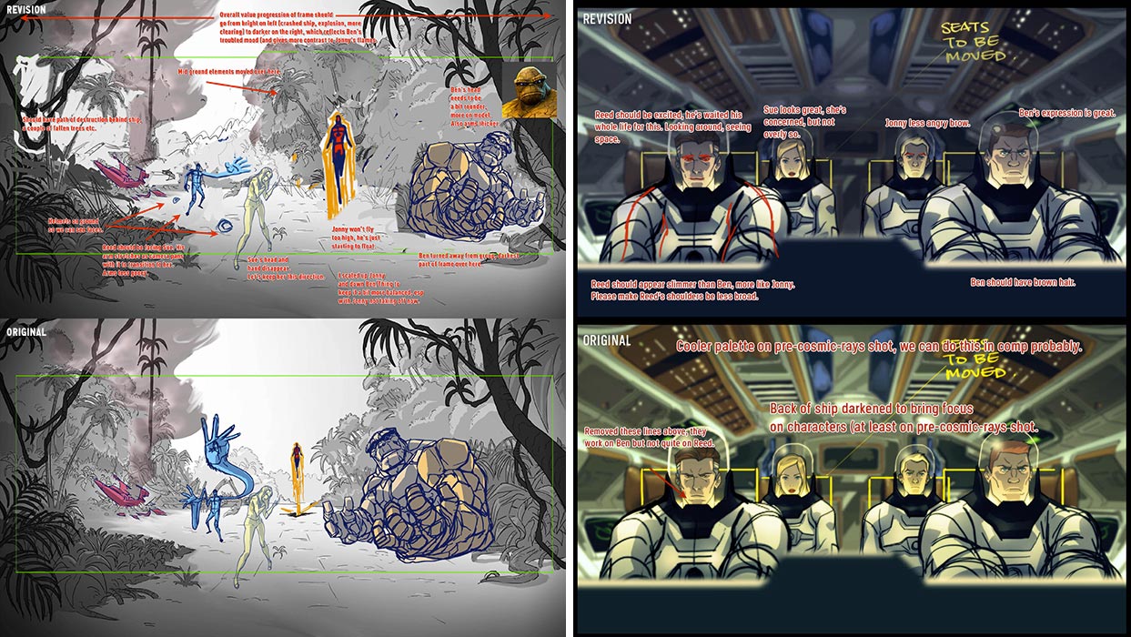
Titmouse did an amazing job on the 2D animation for the game opening cinematic. Juno Lee did the character designs and most of the key shot designs. I gave notes on these mostly to keep the look consistent with how the characters were depicted in-game, and sometimes little adjustments to the shots. I love the work Juno and crew did.
UI
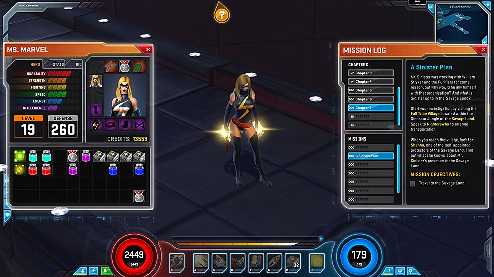
For the UI for the game I didn’t want it just to serve a function or look pretty, I wanted it to have a story reason for it’s look that “made sense” in the context of the overall game. I discussed with Marvel various options (possibly having it based on Avengers, or Tony Stark/Iron Man tech, or Reed Richards and the Fantastic Four) but we decided on a high-tech interface that was created by S.H.I.E.L.D. This enabled us to have communications and missions be sent to the player by S.H.I.E.L.D. agents, and this story framework helped guide the visual design. There were hundreds of hours of meetings to figure out usability, systems, and of course basic interaction, but it was super artist JK who crafted the final high tech look that really pulled it all together. Creating the hundreds of icons that had to summarize a super power in a 64×64 pixel canvas was a big challenge, sometimes having to get either very literal or very abstract with the concept and graphics, and artist Nino Navarra did the final graphics for them.
Logos and Identity Design
I made the logo for the game, actually 3 times, as we first changed names and then went for a different look. Final logo above.
I also made the logo for our studio within Gazillion called “Secret Identity Studios”.
Key Art
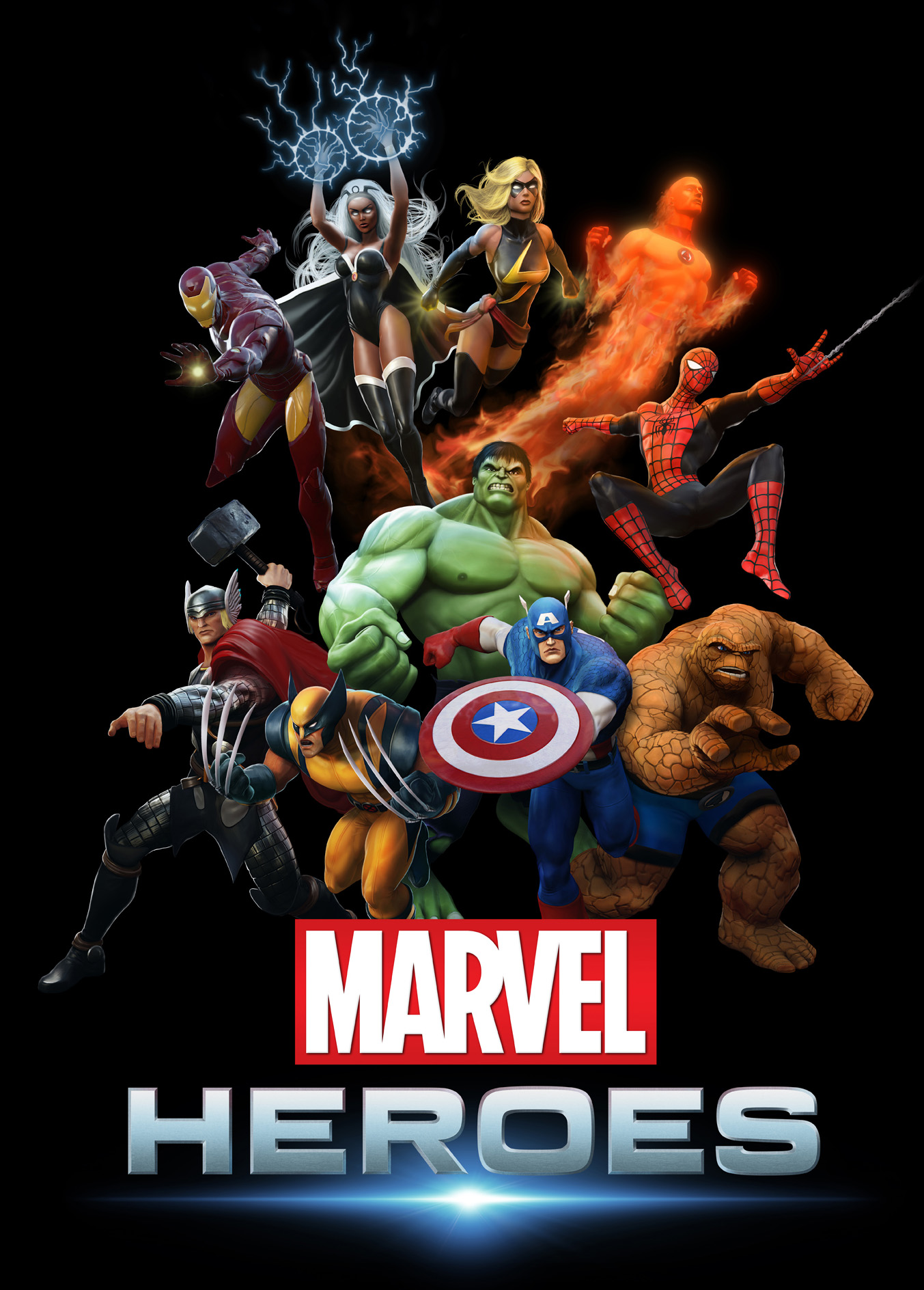
For our first piece of major key art (right) I posed the characters in Maya, then the character team rendered them out, and we all worked on paintovers in Photoshop on different characters and I did the final compositing.
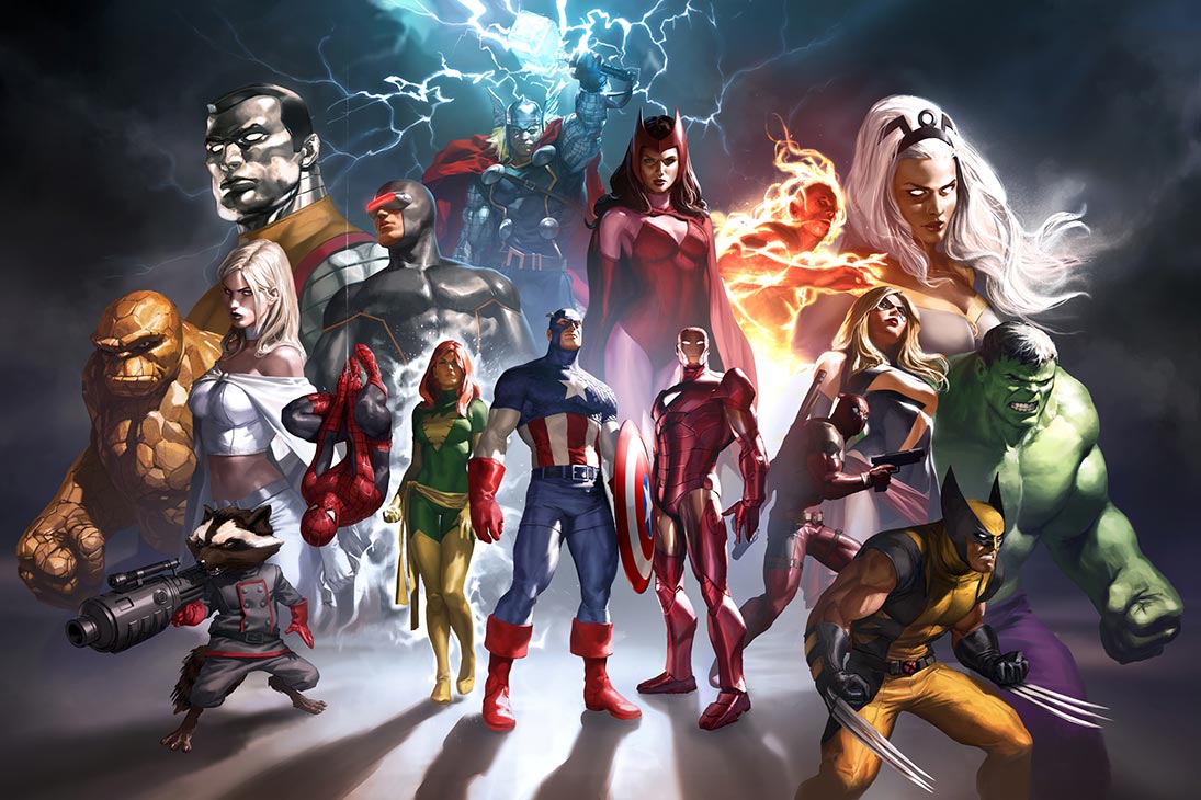
Our second major piece of key art was by Marko Djurdjevic and his team at Six More Vodka. They just knocked it out of the park. I gave minimal notes on behalf of Marvel and our team, but it was a just beautiful piece that was also a poster giveaway at some conventions. Amazing work, and great to work with such talent!
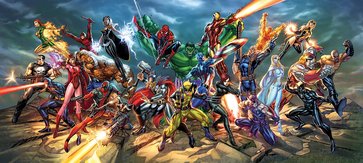
Our third piece of major key art was this stunning piece by J Scott Campbell, with colors by Nei Ruffino. A huge challenge because of several factors (it had to be divisible into three groups of heroes, each with an equal division of Marvel “families”, and just the sheer amount of work that went into it. Seeing it come in from the rough stages on was super exciting, and it was great working with J Scott.
Four years, hundreds of characters, dozens of environments later…
My four years on the project were a career highlight. Working with the amazing Marvel IP, building out the art team, helping define the characters and powers, directing the cinematics, meeting fans at SDCC/NYCC/PAX, making new comic artist friends… what an amazing project, and a special dev team to be a part of!
